
TLDR Key Takeaways
- Modern-day technology has gifted marketers with the ability to build, test, and optimize the full funnel.
- CTAs, building trust, and focusing on the benefits are all very important.
- Live chats, calendar booking tools, and quizzes are a must to add.
- Trying out pre-warming your prospects can be extremely beneficial for your conversion rate.
Introduction
Take a second and think about what the single most impactful change is that you can make to improve your PPC campaign.
If you are stuck do not worry, it is your landing page.
Now figure out if it is easier to double your traffic or double your conversion rate?
Going from a 2% to a 4% conversion rate is highly possible and doable. On the other hand, going from 5,000 visitors to 10,000 visitors is either very expensive, extremely unlikely, or both. You would need to double your marketing budget, make some massive SEO improvements, or do some incredible optimizations to make it happen.
The results are the same but the pathway and price tag to get there are enormously different.
You are just a few steps away from getting the amazing results you want from your landing pages without breaking the bank. I also share a few bonus tips, free resources, and tech tool tutorials that will help you in progressing your landing pages further.
By adding landing pages to your skillset you can go a lot further into the funnel and make a bigger impact on your brand, clients, and team.
The Importance
Historically digital marketers had a lot of control over the top of the funnel lead generation. Things like driving clicks and leads but they rarely had any control when it came to interest, decision, or action. Through using modern software, like Unbounce or Google Data Studio, it is easier than ever before for marketers to build high-converting landing pages and powerful reporting dashboards.
Giving us the opportunity to build, test, and optimize the full-funnel finally gives the marketer more control over performance from lead generation to action.
There is no more fear or frustration when working with a web designer or data scientist that has no knowledge of marketing. You are no longer at the mercy of a web designer since you now have the ability to create and optimize everything on your own.
The Elements
CTAs
A call-to-action (CTA) is an essential part of a landing page. It will usually be a button that is guiding a user to do what you want them to do next. Whether it be buying your product, watching a video, donating, etc.
On the landing pages, I have created I like to have a hard call to action with a soft call to action following. For instance, you might have your hard CTA say “Buy Now” with a “Learn More” button as your soft CTA right next to it. This way you make it easy for your prospect to buy if they are ready to. And if they are not ready to take that step right away you have a place for them to go instead of them leaving the page.
More often than not, when people get to a website their eyes will naturally go in a Z pattern. This means you should be putting your CTAs in that Z pattern so that people instantly see them rather than skipping over or missing them. Do not be afraid of putting multiple CTAs on your landing page. Sometimes people hold back and only put one or two but I have had four or five on a page before because I try to give the user as many opportunities as possible to convert.
You want people to stay or follow through with the CTA on your landing page and not bounce. To accomplish that you need to have highly relevant landing pages matched with highly relevant keywords, more on this later.
Here is a representation of what a hard and soft CTA would look like on a landing page:

Five-Second Rule
If someone has no clue what your product/service is and they happen to stumble upon your landing page they should immediately understand your business. It can be easy to get so into your business, that you assume it is obvious what you do and everyone understands it as well. One of the best things you can do is to take a step back and think about your company, brand, and products/services with fresh eyes.
If you woke up from a coma or washed up on a beach and there was a laptop placed in front of you with the landing page on it. Would you understand what the business on the screen does? If you cannot come up with something at least similar to your product or service within five seconds, you need to rethink your messaging and the imagery.
Benefits Over Achievements
Illustrate customer benefits instead of company achievements. This is a mistake that I see frequently, so do not worry if you catch yourself falling into the trap.
Companies can be very proud that they have been in business for 45 years, won all these awards, and worked with some fancy company. Yes, it is good to add some logos, awards, etc. for credibility and it is completely fine to be proud of those. It shows that you are an established and accomplished business, but it is not the main thing that you want to highlight. What you want to focus on are the benefits to the customers. Think about what your customers are looking for and why they are coming to you. They have a problem and they are trying to find something to solve it, hopefully, your product or service offers them a solution.
Problem-Solution-Results Paragraph
Make sure you always have a problem-solution-results paragraph, and that it is at or near the top of your page. It should contain, what the problem is that the user experiences, what the solution is that you offer, and what their life will be like after you solve that problem.
The goal of this is to try and help your potential customer visualize how much better their life will be after your product or service is in their life. One thing I must note is that you need to be very careful with this paragraph. Upgrow has one and it took me over two hours to write a handful of sentences. The reason they take so long is because you have to be so thoughtful about each word to perfectly convey your product/service. If you are wondering, taking the time to perfectly craft the paragraph is definitely worth it.
Simple and Scannable
Keep the design extremely simple and very scannable. Do not have big walls of text, there is a place and a page for that, but at the top of a landing page is neither.
Depending on how complex your product is it may be good to give a bit more information further down the page. It is crucial to try to keep it as short as possible while still saying everything you need to inform the user.
People do not want to pick up a book, they want to briefly read something to validate that what you offer is going to be the solution for them before they invest in reading every word on the page or website
It is rare that someone will enter your page or website and start at the top of the website and then read it all the way to the bottom. You want to keep it scannable so people can find sections of the page that appeal to them.
To add to the simplicity, it is really essential to not have header navigation. It can lead people on wild goose chases, they click off the page and read your blog, about us page, click around some more, and before they know it they have forgotten to apply. You need to give them a clear direction and essentially forcing tunnel vision, blocking them into a corner where they either convert or decide it isn’t for them.
Clear Next Steps
To go along with the CTAs, another thing you have to do is define clear next steps, that are fast and simple and make it easy for your users to follow them. Having something that outlines the steps and the ease of them will only make the landing page more attractive, user friendly, and increase your conversion rate.
You want to make sure that they are clear and direct, without seeming too forceful. You do not want someone to click onto your landing page and then not know what the next steps to take are. But at the same time, people hate being told what to do, find the balance and you are golden.
Build Trust
Similar to the five-second rule, try to build trust immediately with the prospects that are visiting your landing page. Some of the common ways to build trust are through testimonials, displaying the number of clients served, review stars, certificates, press mentions, etc. Try to make them things that can make the user think that you are a legitimate company within a second. And that they can trust you with their time and their money. Another good way of building trust is through toning down the mentions of price as well as terms and conditions.

Benefits Over Features
Corresponding with benefits over achievements it is necessary to be thinking and highlighting the benefits, not the features. Write about what the benefit is to the user, not the feature is that your brand has.
A feature would be we have a 400 horsepower engine, while the benefit is the car goes really fast, zero to sixty in 3.5, etc. Of course, some people might be interested in the number for the horsepower, but your average person walking in will be more impressed by the benefit and not fully understand the feature. You want to make it as easy as possible for the user to visualize why they would want your product.
Supercharging Your Landing Page 101
Software
The landing page designer that we recommend is Unbounce. They make it remarkably easy and simple to build beautiful landing pages. There are templates for almost every industry and category, and it is a quick drag-and-drop editor, with close to no learning curve. If you have used anything like SquareSpace, or Wix you will catch on in no time, and even if you have not used something like it, it is extremely easy to catch on. An added bonus is you can integrate it with a CRM so if you are using Hubspot or Salesforce any lead that comes through the page will go straight into your sales platform.
Test, Test, and Test Some More
Make sure you have ongoing testing, one thing that is fantastic about building on a landing page builder is the independence that it gives you. You do not have to wait on a developer to build two versions of the page and then deal with trying to figure out what would be the best way to split test them. With a platform like Unbounce, you can very easily split the traffic between different landing pages and test to find out what works best to convert your prospects, and then you can hone in on that.
What you can test:
- Headlines
- Copy
- Order of elements
- Design
- Offer
- Images
- Videos
- And more!
One thing to note is that it is okay to use the exact same formulas for your landing pages. On Unbounce there are only a handful of obvious templates because those are the ones that work and work well. Of course, there is a lot of customization available within those templates but the bare bones stay consistent.
Do not fear this you do not have to reinvent the wheel, people’s minds are very familiar with what a website should look like. If you have a crazy, out there, and what some would call innovative designs it usually does not work as well. People do not want to waste time trying to figure out and learn how to navigate your website.
Break Out Everything
One thing that I see marketers doing way too much is driving all of their traffic to one landing page, or worse, sending everything to the homepage. Preferably, you need to have a different landing page for each major keyword/audience group. As well as matching the different audiences with corresponding offers that will be more appealing to them.
For instance, at Upgrow we offer both PPC and SEO, it is difficult to communicate all of that on one page concisely. I would rather spend the time and create two versions of the landing page, one for PPC and one for SEO. I prefer to go even more specific than that, I like to niche down to SEO for the B2B tech industry or PPC in San Francisco.
This way from a user’s perspective they see that we can do exactly what they want or are located precisely where they need us to be. They do not have to search the entire website to find the sections where we talk about B2B tech marketing with SEO it is right at the top and the whole page is dedicated to it.
An added bonus is that this will also help boost your quality score. A good Google Ads quality score is extremely important. It dictates how high your cost-per-click (CPC) will be, which determines how much you will be paying on your ads. So, when you build a landing page that is dedicated to a specific keyword/audience you receive a higher quality score.
One feature that I would suggest using to further improve your quality score is dynamic content. You use it to match search keywords exactly to your landing page. It works by noticing whatever the keyword is that the user used, and it injects it into the landing page in whatever way you would like. It could be a heading, specific text, or anything your imagination can come up with. This way you do not have to create a new landing page for each keyword, and it further improves your quality score all while making the page more relevant to the prospect.
Upsell on the Thank You Page
I see so many marketers who have a thank you page that simply says thanks for signing up here is your download, or slightly better they say thanks for signing up we will email you your download. It is always a bit of a letdown, they have momentum, a conversion just happened, the user is letting you know that they are interested in you. Why would you hit them with the brick wall of thank you pages? At Upgrow we found a way around this through having landing pages designed in a multiple-step process.
Step 1 – Get access to this video case study, we show you how we increased leads by 775% in three months with one of our clients.

Step 2 – As soon as they fill out the form, of course, they get the video and it automatically plays. But right below it on the same page, they have the ability to schedule a call.

This way the momentum keeps going, there is no wasted time, and there is definitely no abrupt stop in the flow of things either. The alternative method would be they leave, maybe you retarget them, and eventually if you’re lucky you get them back on the website to schedule a call with you. Why not just do it straight away?
Optimize for Mobile
One thing that you need to check out is the mobile version of your landing pages. More and more traffic is coming through mobile devices, which means that your website and your landing pages all need to be optimized for a mobile device.
It is no longer enough to have a good-looking website just on a desktop. Thankfully through using a tool like Unbounce or Instapage make it extremely easy to check on how your designs look and edit them to make sure that your landing page looks good on all devices.
Lead Conversions to Try
Live chat
No matter what your product or service is a live chat is always good to have on your website but it will not always make a drastic difference. For example, we have one on our website and it gets maybe a chat a week, but we have added them for clients where they received thousands a week.
Some good options for this are either Drift or Zendesk, there is usually a free trial period for the tools. I would suggest taking advantage of this and trying a few out different ones to make sure you find the one that suits your needs.

Calendar booking tools
These have become essential for both Upgrow and a lot of our clients, and I highly recommend that everyone implements one onto your website.
In every way, they are superior to someone filling out a contact form and then having to go back and forth to try and figure out a time that works. When there is a good chance that they will not even show up to the meeting. They are linked with your Google calendar so the prospect can see when you are available, they obviously know when they are available and they can book a meeting accordingly. There is no hassle, it can be done in a few minutes and is seamless.
An added bonus I have found it that the show rates for when someone books through the calendar booking tool are about twice as high. One thing that really helps improve the show rate depends on the tool that you are using, but for some of them, they send a text reminder for the meeting about an hour before which makes it less likely that the prospect will forget.
If you are interested in adding one, the most basic and well-known tools for this Calendly or Hubspot. If you hate them no need to worry, there are plenty of tools like this out there ranging in prices, styles, and customization abilities. So, do not be afraid to do a bit of experimenting and digging around to find the one that you like best. It should be simple for both you and the prospect.

Quizzes
A quiz can be an extremely effective tool to use. For some reason people love them and it helps them to get more engaged and invested in your website and company. A good strategy to use is something along the lines of they answer a handful of questions and then to actually see their results they need to enter their email. Usually, if someone is that committed and they have already finished the quiz they are extremely likely to give up their email.
One of the best tools to use to create a quiz is LeadQuizzes, they offer in-depth reporting and plenty of different types of quizzes and surveys to create. It is designed for agencies, but even if you are not an agency it is an excellent tool. There is also Interact, which is a simpler tool and meant for single companies. A good example of quizzes on a website are the ones on BrightEdge.
Slide-Ins, as Opposed to Popups.
The benefit of slide-ins is that they do not block the page and are a lot softer CTA compared to a popup and oftentimes if the offer is good, have just as high if not a higher conversion rate. Something to note is that they should be relevant to the page. You may need to create different slide-ins for different pages to increase your conversion rate.
In my opinion, the one exception where you should go for a popup instead of a slide-in is for the exit intent. This means that if someone is moving their mouse like they are about to exit the browser then and only then does the popup appear. You would be surprised by the number of people that enter their email for an exit-intent popup.
Here is an example of a slide-in:

Case study
We had a B2B technology client and before we started working with them they were only driving prospects to their homepage or service page. They are now driving prospects to all traffic of the different landing pages we built for them on Unbounce. Before they had a 4% conversion rate, and almost immediately they had a 300% improvement without any additional costs except for the time it took to create high-quality landing pages.
Tech Stack
Of course, you will want to set up tracking and analytics. Here are the tech tools that we suggest you use. The learning curve for them should not be too bad and we have a tutorial for setting up it up.
Google Tag Manager
I always recommend setting everything up through Google Tag Manager (GTM). GTM is essentially a container, it can host all of your pixels and tracking and makes it easy to access. A good way to think of it as a portal into your website. Through GTM you can easily place all of your pixels and tags into GTM with peace of mind knowing that you will not break your website and without bugging your developer. It makes everything very simple, easy, and free.
If you do not already have it already, installing Google Analytics (GA) is a must. You can install it through GTM for even easier access. Here is a tutorial for how to set up GTM, implemetn GA through GTM and how to set up event based tracking.
Google Data Studio
The best way to think about Google Data Studio (GDS) is like a dashboard for everything. With it, you do not have to log into LinkedIn, GA, HubSpot, and everything else that you have. Export it all, and try to do some Excel wizardry and then use that data to make a report, when you only have a short amount of time. Make your life easier with GDS, it automates the process and updates all of your data in real-time.
To access those integrations you need a platform like Supermetrics. Supermetrics is a third-party data integration provider. It can pull data from LinkedIn, Google Ads, HubSpot, Salesforce, and all of the other items you use in GDS and create some amazing dashboards.
Bonus tips
Pre-Warm your Traffic
You pre-warm your prospects by taking them to a presumably fair PR website that then leads to your brand website. If you prewarm your traffic you get a higher conversion rate and build credibility all at once.
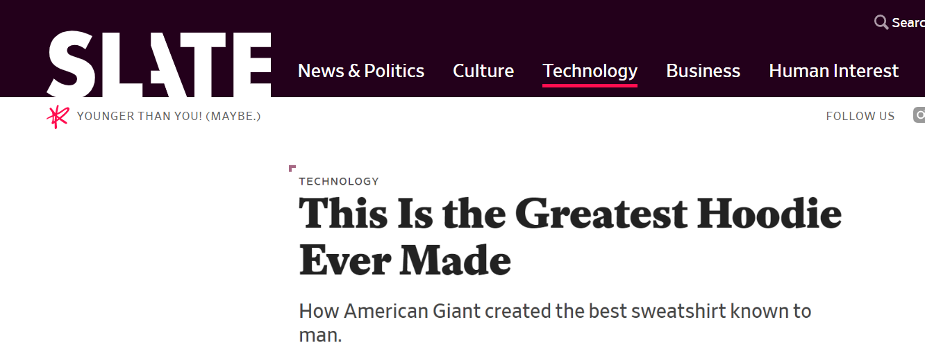
A good example is from a few years back I was seeing a lot of ads from American Giant. The brilliant move they decided to take is rather than sending the user to their homepage or a landing page. They took me to a Slate article where they were praising the brand and calling it the greatest hoodie ever made.
This was most likely paid PR, but it looks organic to an unknowing eye. This way the user thinks that Slate is an unbiased source and if they think it is a great hoodie that is immeasurably more creditable than American Giant saying their hoodie is fantastic since obviously, they will think that their hoodie is the best.

Why it Works
Since the users are warmed, it builds trust especially if the prospect is already familiar and trusts the third-party platform. The website saying you are an awesome brand is a lot more impactful than you saying you are awesome. Users are warmed before hearing your message which makes them a lot more open to converting.
How it Works
Connect with an authoritative and trusted content publisher in your niche whether it be a blogger, newsletter, company, etc. to see if they will do a review. Always be prepared to offer some money/sponsor the review, people rarely do anything for free.
Add a prominent (and tracked) link from their positive article to your landing page. Notice how I said landing page and not the homepage. Through the tracking, you can see if it is worth the additional cost of driving to the third-party website or if it would be better to point to your own page. We did a test for a client where we found out that pre-warming led to a 40% higher conversion rate. So it is definitely worth it for some companies, but not everyone.
Heatmaps
These provide visibility into how users interact with your website. This way you can tell what they like, where they get lost, what they ignore, and more!
A good option if you want to implement this is HotJar, it is free up until 10,000 page views a month and they have some really cool features from different kinds of heatmaps (pictured below), poll, forms, and more. They can also do screen recordings so you can see a person’s mouse moving around on the screen. It helps you to see where users are getting lost and confused and then work on a way to fix it.

Free Resources
Here is a link to some free resources that we have on our website. On it, there is a free GDS template for you to use. All you have to do is copy the template, connect your data from GA and other sources, and customize to your liking. Just like that, you will have a beautiful dashboard to view and display your website’s data.
Conclusion
If you implement these strategies I can pretty much guarantee that the conversion rate of your landing pages will skyrocket. It is a quick win that can drastically improve your outcomes. It will also help to lower your CPCs and gain more control and knowledge of how your full-funnel is operating.
If you are either unsure about your landing page skills or do not have the time to deal with it feel free to book a consultation with us and we will happily help you out with whatever it is you need. You can also check out our services page to see if there is anything else that we might be able to offer for you or your company.

